26.8.14

The Illusion of Ease

Ease and effortlessness are essential to so much creative work. From an effortless bow change to an oil painting that masks all brush strokes, ease allows other emotions, characteristics, ideas, and experiences to hold central focus.

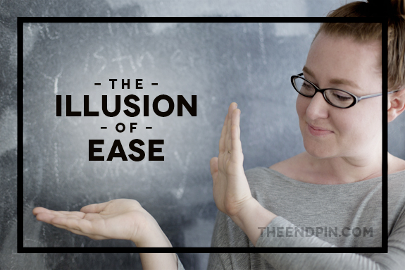
But ease is almost always an illusion.

Illusion of Ease Title

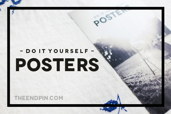
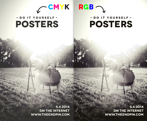
For example, I started The Endpin in May, 2014. To a visitor it might look as if I were able to launch a blog with a custom design, publish posts that have been widely shared (PS thank you for that!!), use original photography, and cover a variety of relevant topics in four months.

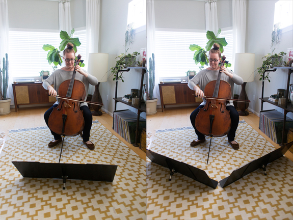
In reality, I've blogged about other topics for 5 years, I've taken e-courses on blogging, I've learned rudimentary web design over about 5 years, and my first blog looked like crap. I've steadily improved my photography over 4 years, I've been interested in and actively studying graphic design for about 3 years, and I've worked part-time as UCSD Music Department's Promotions Graphic Designer for 2 years. I thought about starting a music blog for ages before deciding I had information worth sharing, then I journaled blog topic ideas for several months before writing my first post. Each post is based on an idea I've considered at length (sometimes for years) and can take anywhere from 3-14 hours to photograph, write, and edit.

Illusion of Ease small

I don't want readers to feel my efforts because it would distract from the point of my posts. (And this post is absolutely not to show off how hard I work - the cult of "I am so busy" ISN'T the solution to the illusion of ease.) But, it's important to know that my work isn't the result of a first try. I've experimented with, learned about, mulled over, and (to be honest) failed at so many things to get to this point.

If someone else were interested in creating a similar blog, it would take a similar amount of effort and accumulated experience.

Working towards our creative goals is hard, and when we buy into the illusion of ease we risk inviting floods self-doubt and criticism into our creative processes. While self-doubt and criticism are completely unavoidable - they're feelings every artist learns to manage over time - they become problematic when the feelings are so consuming that they overwhelm our efforts. We quit.

Ira Glass articulates it beautifully in this interview by Current TV
(animated by David Shiyang Liu).


Understanding that, as a rule, good things take effort normalizes the effort each of us experience when we try something new. If we know that achievement takes time, no matter how easy it looks, we can move from "I'm not good at ___" to "I'm not good at ___ YET"

Grappling with the illusion of ease means holding two truths simultaneously. We must both experience creative works as they're intended (usually without a projection of effort) AND cultivate an understanding of the effort all creative endeavors require.

19.8.14

8 Free Resources for DIY Websites

Website Resources Header

Generally, life as a musician is built on a shoestring budget. And, while there are many affordable website design options out there, nothing beats free. Below are the 8 Customizable, High Quality, and FREE Resources I personally use to create my cello website.

Free Service Images blogger

1. Blogger

Yes, it's designed as a blogging platform, but I've found blogger to be so easy to customize that I love using it for my website. An added bonus, its massive user base has resulted in an endless supply of tutorials. If you'd like to do something with it, there are probably detailed instructions out there already. An additional advantage is that, since it's hosted by Google, blogger servers rarely if ever go down - you won't have to worry about your website breaking.

See it in action || Other options: Wordpress

Free Service Images flickr

2. Flickr

If you'd like to add images to your website (and you probably should), you'll need a service to host them. While, there are many many options out there, I use flickr because it maintains the high quality of my photos and is so easy to use.

Other options: Photobucket, Picasa (Google+)

Free Service Images dropbox

3. Dropbox

If you'd like allow visitors to access files on your website (maybe an EPK, different versions of your bio, or free downloads), Dropbox is an easy file hosting service. Also, if you're managing a website with others (say, as part of an ensemble), Dropbox is build to be easily sharable and collaborative.

Other options: Google Drive

Free Service Images youtube

4. YouTube

Ubiquitous on the internet, YouTube is my go-to host for videos. It used to have a lower visual quality than Vimeo, but has massively improved in recent years. The added bonus of a very active community (don't read the comments though!) makes this my preferred video resource.

See it in action || Other options: Vimeo

Free Service Images soundcloud

5. SoundCloud

To be honest, I haven't delved completely into everything soundcloud has to offer, but I love that you can customize the embeddable audio player to blend seamlessly into your web design.

See it in action || Other Options: Bandcamp

Free Service Images calendar

6. Google Calendar

Most musicians create their online calendar by simply adding text to a webpage, but I find that very difficult to update - I always forget! For me, the best solution is to embed a google calendar (which I already used for all of my scheduling) into my website. When I add a calendar to my personal account, it automatically updates my website. This solution has the added bonus of doubling as a "Past Concerts" page.

See it in action

Free Service Images mailchimp

7. MailChimp

When I first started using MailChimp for my newsletters, I really appreciated how easy it was to use. Even more impressive (though admittedly not quite as easy) is how seamlessly I can embed the MailChimp newsletter sign up form onto my website. It's practically impossible to tell it's an external service at all!

See it in action

Free Service Images analytics

8. Google Analytics

I use Google Analytics to learn how to improve to my website. From how many people visit to where they come from, having a good analytics system in place helps me decide where to effectively invest my efforts.

By no means breaking news, together these free services provide me with everything I need to have a self sustaining web presence. If you have other services you use and love, please leave them in the comments below!

13.8.14

Extra Low Music Stand

Low Stand Title

One of my great enduring struggles as a cellist has been the traditional music stand. Yes, it holds my music very well, but it also creates a giant blockade. Meet the Dead Zone.

low stand

I hate the dead zone. It visually (and to a lesser extent acoustically) blocks all of the most interesting sounds the cello can make! So while learning Lachenmann's Pression, which specifically requires the cellist/cello to be visible, I began a quest for the perfect low music stand. And I found it.

low stand_2

Pictured above is a Manhasset Table Top Stand, which, it just so happens, also works very well on the floor. The stand is stable, looks nice, and is completely unobtrusive.

In the interest of full disclosure, there are three downsides to a stand this low:
1) you have to know the piece well and have good enough vision for the distance
2) it's difficult to see collaborators (ie conductors or chamber music partners)
3) page turns are difficult at that distance

But if you add Stand-Out stand extenders, you should have no problem fitting your music without needing page turns.

low stand expanded

With extenders, you can easily fit 8 pages of music (probably more if you consider your page size carefully). When collapsed, two stands with their extenders fit in carry-on luggage and can be held with one hand.


All together the two stands and extenders will run you about $90. There are cheaper options out there, but I haven't found anything that's as durable, nice looking, and easy to transport.

Cellists, get excited.

7.8.14

DIY Concert Posters

Poster Title

Over the past two years, I've been in full-on visual promotions mode as the Productions Research Assistant for the UC San Diego Music Department. Basically my job has been to make digital and printable posters/flyers.

Do it yourself promotions are actually pretty darn easy, but the learning curve for poster printing basics can be pretty confusing. So, from someone who's been through it (often the hard way), here are the printing basics you need to make your own professional looking posters.

Posters copy_1

*Parts of this post assume access to some kind of image-making software like Pixelmator or Photoshop

1. Image Resolution: When creating your poster image for print, always set your resolution to 300ppi (pixels per inch). That's the standard resolution for print. Resolution for digital posters (images online) can be 72ppi, a much lower resolution.

2. Paper Size: While 8.5x11 paper is the easiest to do yourself, using 8.5x14 or 11x17 paper will give you a more custom (and thus more professional) looking poster. I almost always make my posters on 8.5x14 paper, then get them printed at a local office supply store on a laser printer with nice quality paper.

rgb cmyk

3. CMYK vs RGB: Printed images should always be made using CMYK color settings - pigment based colors that will translate to printers with high fidelity. Digital pictures should use RGB settings, which are colors based on light. If you mix up the two color settings, you'll get images that don't look how you intended them. For example, in the photo above you can see how a CMYK image looks faded compared to an RGB image when viewed on your computer screen.

Posters_5_1

4. Full Bleed: When an image goes all the way to the edge of the paper it's called "full bleed." Full bleed is a kind of illusion because printers can't actually print to the edge of paper! To get the full bleed effect, you have to incorporate extra image around the perimeter of your design, called the bleed, then crop your poster.

Posters_6_1

As a general rule, always add 0.25 inches of bleed to your design, then use a paper cutter to cut off the excess edge. If you have a program like InDesign, you can even add crop marks to show you exactly where to cut.

5. Image Rights: When you're making a poster, it can be tempting to grab the first great image you see off of a google image search, but that image doesn't belong to you. Always get permission to use another artist's image, or better yet, make your own!

Posters_1 copy_1

It might all seem like overly complicated jargon at first, but these basics can become second nature in no time. Depending on the software you use, solutions and tutorials are usually just a web search away. In the end, it's pretty simple to up your promotions game and get butts in your concert seats.